When we began to think about how to establish a more rich and warm collaboration with printers after the cold alerts we experienced during OSP production, Georges Charlier’s appetite for research and openness to exotic solutions reappeared in Pierre’s mind. And since we are preparing some new books, it was time for an update on his approach.
Georges Charlier is the passionate owner of pre-press, printing and publishing house Salto. He lives and works in Ulbeek, Limburg (B) where he restores a former brewery, and transforms it into a platform for the production and conception of extraordinary publications.

Every printed book is an original
On this mornings’ motorway road to Campine, Pierre remembers for Femke his first (and only) meeting with Georges Charlier, around 10 years earlier. Thierry Van Hasselt, comics author and publisher, had spot books outputted by a fantastic printer, that built a model printshop on the border of Belgium and the Netherlands, near the Meuse, in a haunted park. This man would be able to provide extraordinary color separation and printing quality, maybe the best in the world… Thierry and me felt they needed this kind of quality in order to reproduce the subtle greasy drawings in Gloria Lopez, Thierry’s book they were working on at the time. Follows a fever meeting and tour by former photographer Georges through the whole chain he has built: a repro-table with natural light and Nasa photo sensor, to avoid the brutal lighting of hi-res scanners (too high contrast); ultra high care color separation with in-house software recipes; exotic screening with an optimised solution of half 600 lpi and half stochastic rasterization and luxurious printing, combining warm grey, transparent and an opaque black ‘skeleton’ to match the matte quality of a litho crayon.
Far from the kind of glitter fireworks printers usually send us as new year’s eve auto-promotion, this exceptional person was convinced that every book, even in large scale print run, is an original, the original. And that every stage in the process is a step to achieve the final and best result in the hands of the viewer, or user. A statement we 100% shared for the contemporary comics like Fréon was publishing. A few weeks after, Thierry literally lived there on the machine and an impressive volume was produced.
The tunnel of production
Today Georges Charlier explains how he felt frustrated by the tunnel view approach to much contemporary printing workflows. The effect of ISO-standardization might be that overall printing quality has increased, but often there is not much space for experimentation and above all specific quality. “In the United States, color specialist became known as agitators, as troublemakers. In the interest of survival, the printing business tries to streamline the process from digital file to a printed product as much as possible”
Printer without printshop
It might be the result of very practical and economical constraints, but it does not come as a surprise that Georges habitually uses the presses of his colleagues rather than his own printshop. Out of necessity, he has learned how to practice high quality printing without attaching himself to his own machine park. The experience of traveling between materials and setups has made him aware of the differences between presses of various makes. As a way to enforce a serious conversation with press manufacturers, he eventually made up his own ‘acid test’. A collection of seemingly simple black and white images enables the analyses of radical shifts in quality between machines. We imagined the tense silence in the Heidelberg boardroom when he unfolded his test sheets, the complete management had gathered for the occasion. He printed the same sheet not only on the respectable German presses but also on a Roland, a Mitshibishu, a Komori and a KBA. Afterwards, in the corridor, the staff of engineers thanked him for pointing out to their bosses that even at Heidelberg there was room for improvement.
Material knowledge
On multiple levels, our conversation touches on the way material and knowledge, objects and software are intimately interwoven. It has motivated Georges to develop his own tools, and also his own paper. After an intense collaboration with the technical staff of a small paper factory in The Netherlands, he managed to develop a paper fit to his needs: a slightly ivory, matte but silky surface which supports the reproduction of a series of photographs by Bauhaus photographer Moï Ver. But the company went bankrupt, and although he still has access to the recipe, without their expertise and equipment he will not be able to produce the same quality paper ever again.
Spectral colors
“I met likeminded people like in the Netherlands, and we said to each other: let’s drop the old Lab color system, and try instead to build a new spectral system“. Georges is busy developing color systems that are not limited to the traditional 3, 4, 6 or 7 values, but that are based on various separation operations that depend on what we want to store and retrieve on paper.
When the CIE Commission internationale de l’éclairage begin to build the RGB color models in the 1920′s, it made sense (and fit with the mathematical computation power available at the time), to simulate the regular way our eyes simplify, with the help of three kinds of cones, infinite physical color wavelengths into three color values, as an event, before they are quantified and evaluated by our brain. These models were developped using some statistical averaging between samples of observers. And these subjective observations were than normalized to build a model that pinpoints specific and measurable wavelengths.
So the perception of these observers ended up in two overlapping simulations at work when we look at printed pictures: the one their cones have provided, and the result of the combination of three different inks chosen for their direct relation with the wavelengths that please these same cones. This synchronized simplification helped further models based on RGB (notably XYZ and Lab) and paved the way for the current ISO separation model used widely for most of the quadrichromatic printed images nowadays.
But we lost a diversity of color events in that double reduction: mostly all saturated colors in between, and colors that look the same under certain conditions but not under others (a phenomenon linked to metamerism). And if we experience everyday marvelous and rich color events in our brains, all different depending on our sex and origin, we have also progressively standardised the way we perceive printed color separation and the amount of colorised experiences we’ve acknowledged not to find in there.
Georges’ openness to rethink the color model will not only benefit color reproduction, but also in another field of his activity, the archiving of sensible material. And it’s use can even be enlarged with the archiving of information about actual pigments in the file format that stores the full spectral data of an image.

Explorations
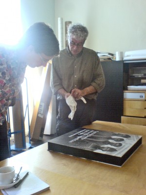
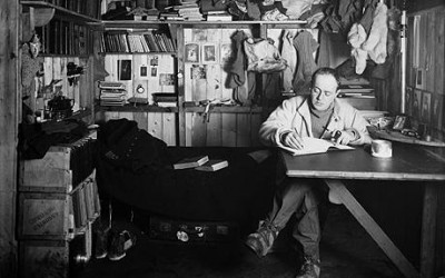
He is finishing a special edition of images from the archives of the Scott Polar Research Institute. He puts on white gloves and shows us 5 cahiers of photographs taken by Herbert Ponting. The images document the catastrophic Terra Nova expedition undertaken by Robert Falcon Scott in 1912. Duplicates rather than reproductions, these contemporary platinotypes are meant to survive their originals (assumed life span ca. 1000 years). Their exceptionally refined quality is accentuated by the bristle character of their subject matter. Scott and their party never returned from the Terra Nova expedition. But the penetrating gaze of those adventurous men, dressed in layers of self repaired clothes, will miraculously survive after being photographed, archived, scanned, digitized, described, retouched and finally printed in three monochromes on acid free paper.

Tags: · Colors, Printing + Publishing, Tools
Conversations · June 27th, 2009 · Pierre, and Femke