extract from ["Experimental typefaces of William Addison Dwiggins: Falcon, Charter, Arcadia, and Stuyvesant"](http://www.typeculture.com/academic_resource/articles_essays/pdfs/tc_article_36.pdf) by Tiffany Wardle, University of Reading, 2000.
Appendix B – ‘M’ Formula
The ‘M’ Formula, or the “Marionette” Formula, is perhaps the most important of all ideas that Dwiggins came up with as he was attempting to create his marionette puppets for his playhouse. He subsequently applied this same theory to his type designs. It is included below in its entirety as it was written, the illustrations are on the page directly following. This stands as proof of his ideas and methods. The following was transcribed from the Chauncey Hawley Griffith Papers, Special Collections Department, University of Kentucky Libraries; and is a part of the Times Roman Experimental #223 folder.
Memorandum 1. My spies report that he-blooded advertising printers over the country want a type that will carry a good charge of ink on coated stock, and that on coated stock will look crisp and finished instead of blobby and squz-out. They want it, too, for newspaper ads., to get relatively strong color and at the same time a look of finish and snap.
Memorandum 2. I lift these quotes from the article by Raymond Hopper you sent me: “What will be tomorrow’s types?”
“I am convinced that the next step will be... some modification of the beauty that once was Greece and Rome” (I hope so.)
“The classical forms we shall soon begin to return to – even now are returning to – will not be simply the familiar old Caslon.”
“... Whatever... that may follow will have... less to owe to the traditional imitation of hand-lettering... It is cast in metal, cut by precision machines, printed, not painted... The hard, clean lines of gravure processes; the printing of dull inks on even glossy papers; familiarity with and innate love for engraving; the crisp note struck by so-called modernistic furniture, all tend to foster the urge for something brilliant, scintillating. There will be a refinement, a finesse, that was lacking utterly in Caslon and Cloister, however lovely their forms may have been.”
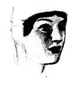
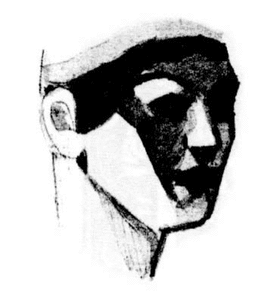
Memorandum 3. In cutting marionette heads in wood I came up against the problem of projecting the face of a girl – so that the doll would really look like a girl of 18 – subtly modelled features, delicate, springlike, young – to the people in the back row. (Aged folk like us are easy to carve, and project) I started by making delicately modelled heads. [Exhibit A] These were charming at arm’s length, but the girl quality did not carry to the back benches. Then I made a discovery. Instead of soft curves for the cheeks, etc., I cut flat planes with sharp edges. [Exhibit B] These sharp-cut planes, when viewed on the stage, by some magic transformed themselves into delicately rounded curves and subtle modellings; and the faces looked like young girls from clear across the room, as well as from the front benches.
Memorandum 4. In the kind of geometrical spinach I have been growing for printers’ ornament, I note that straight-line forms and shapes of geometric curves properly put together achieve more effect of grace of line and curve and motion that do combinations of free flowing curves and shapes. The “grace” quality is somehow augmented – stepped up to a higher level by the sharp angular quality of the elements. Also, a new kind of tingle and life is added to the brew.
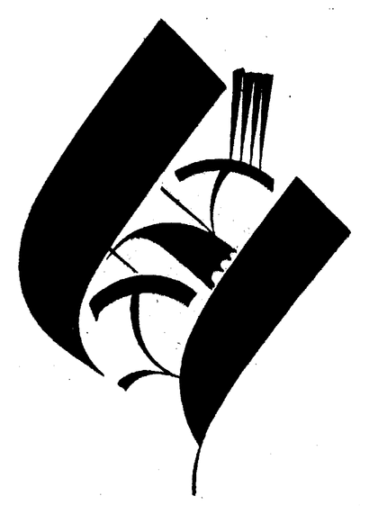
[Exhibit C] is not the best specimen to illustrate the point, but compare, re "vitality" (and projection of the “grace” quality – come right out with it), with Frederick’s [Goudy] carefully constructed curves. [Exhibit D]
I have been cogitating the matters touched upon in Memorandum 3 and 4, with a view to discovering from them a method for modelling type-letters in some other than the traditional way – to produce in the printed words the quite astonishing results I get with marionette heads and with geometrical spinach.
I have tried various schemes, and come out with one set of letters* that, under the reducing glass, shows a good portion of the kind of thing I have been aiming at. You can’t see “it” except in the reduction. The reducing lens I use puts the drawings down to close to 12 point where the copy is on the floor and you are standing up.
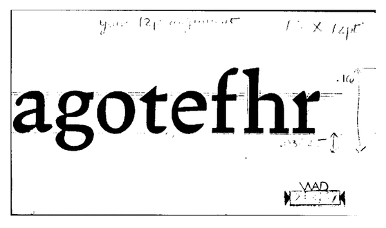
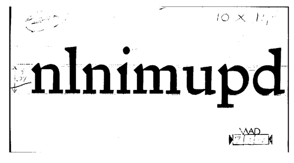
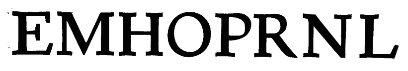
All images appear at 50% of the size as they were in the manuscript.
These letters are “classical” anatomy processed àla marionette. You will see the method in the drawings. It is more evident in the lowercase than in the capitals, but that is OK because most of the character of any font is in the l.c. [lowercase].
One can’t be dead sure, of course, [but] I have the hunch that these letters do not parallel any existing face. They may be worth trying out via the photo-reduction stunt. I think there is something good close along this line.
Appendix C – Action
The following was transcribed from the Chauncey Hawley Griffith Papers, Special Collections Department, University of Kentucky Libraries; and is a part of the Times Roman Experimental #223 folder. While this occurred in conjunction with another design, the word was constantly used throughout the correspondence and was used as part of the vocabulary of Griffith and Dwiggins.
ACTION — re. Exper. 223 [Times Roman]
Need a term to describe a certain attribute of letter-shapes. In calligraphy it would mean the result of the combined motions of hand & flexible [steel] pen. I have used the word “action” to tag this quality. If you think of typeletters as descendents of pen-letters (Stan. Morison thinks we oughtnt [sic] to, apparently) this attribute would occur in type-letters also.
I don’t believe (and you do not either, of course) that you can make a type-letter by copying a pen-letter the way W. D. Orcutt did. But I can’t get away froom the feeling that type- letters ought to have a suggestion of this “action” quality in their curves.
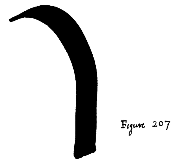
In 223 we have succeeded, even in 7 point, in suggesting this “action” quality by means of the thefty [sic] design of angular and straight-sided shapes – which is what makes me so tickled with the outcome in Proof 3 – and which is the thing that will make 223 look more alive than regular news-type, if my hunch is right. To build up out of angles and straight lines the whip-lash “action” that makes a freely drawn pen-stroke crackle with vitality (fig 207) [and which is so darn hard to draw deliberately and slowly] is a triumph of impressionistic art – and for the M Formula! No?
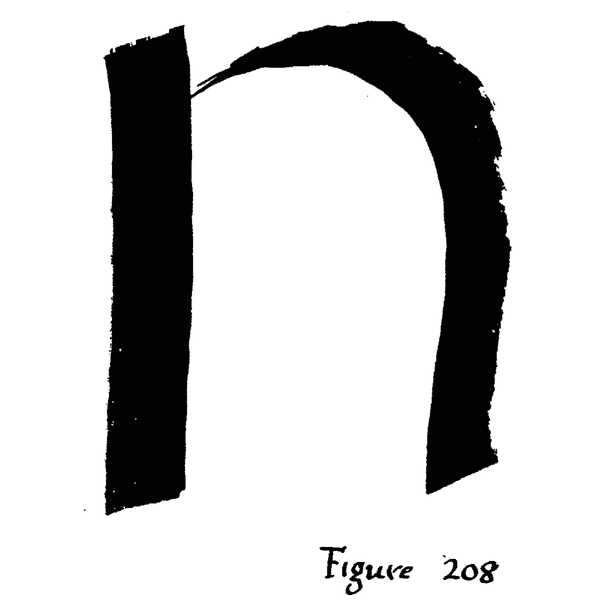
You spoke once about my trade-mark trick of having the arches take away from the stems in a point. Why trick, and trade-mark? Isn’t it just the way nice letters behave? (fig 208)